Why recognizable colors make your music easier to remember
You do not need more colors, you need the right three. How a base, an ink and one accent with strong contrast make your covers, posts and website recognizable at a glance.
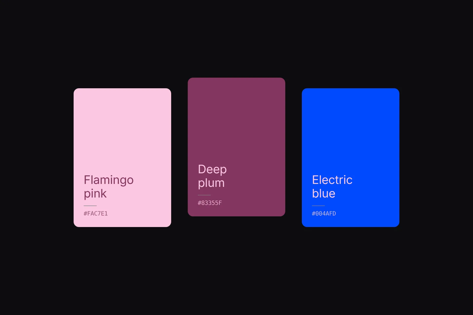
You do not need more colors. You need three that people remember you by: a base for backgrounds, an ink for words, and one accent that does the remembering. Pick them with strong contrast between them, keep them a little unusual for your genre, and use the same three on every cover, post, video and page. After a few releases, people spot you in a feed before they read your name. Try a palette on an artist page in the free Brand colors tool, then save it in Aden.
Why colors make you recognizable
Most people meet your music as a thumbnail: a square in a feed, a story that is gone in two seconds, a cover the size of a stamp on a playlist. At that size nobody reads your name or your font. What they catch is color and shape.
Brand researchers call these distinctive assets: things people link to one brand without seeing its name. Color is among the fastest to learn, because it reads at any size and from any distance. Think of the lime green of Charli xcx's Brat, which turned into a meme and a summer before most people heard a song. Or the way Taylor Swift gives each era its own palette, so a single photo tells you which album it belongs to.
None of that is magic. It is repetition. The same few colors, seen again and again, become a shortcut to you.
Fewer colors, used everywhere
A palette with eight colors is no palette at all. Each new color dilutes the others, and every release ends up looking like a different artist. Three colors are enough, each with a job:
- Base, about 60%. Backgrounds and large areas. Usually very light or very dark.
- Ink, about 30%. Your name, titles and text. It must read clearly on the base.
- Accent, about 10%. The one button, the logo mark, a shape on the cover. This is the color people remember, so use it sparingly.
The 60, 30 and 10 split is a habit from interior design, not a law. What matters is that one color clearly leads and one clearly accents. When everything is the accent, nothing stands out.
Contrast keeps it readable and memorable
Contrast is how far apart two colors are in lightness. It is what lets text be read and what makes a palette feel bold instead of muddy. The web's accessibility guidelines measure it as a ratio from 1:1 (the same color) to 21:1 (black on white):
- 4.5:1 or more for body text, like a bio or tour dates.
- 3:1 or more for big headlines and buttons.
- Below 3:1, use the pair for shapes and textures only, never for words.
Three pastel pinks look soft together, and that is the problem: nothing can be written on them, and in a feed they blur into one wash. Keep one dark and one light color in the palette, and let the accent sit between them. The Brand colors tool shows the ratio for every pair as you pick.
Be a little unusual
Every genre has its default palette. Black and red for drill, pastel pinks for bedroom pop, neon on black for techno. The default is safe, and it is also what everyone next to you on the playlist is wearing.
You do not need to be loud to be different. Swap the expected accent for its unexpected neighbor: an electric blue on flamingo pink instead of another hot pink, a watermelon pink on mocha green and sand instead of the usual earth tones, a scarlet red on Egyptian blue instead of black. Keep the mood of your music, change one color, and you stand apart.
Bring the colors into everything
A palette only works if it shows up everywhere someone meets you:
- Covers. The accent as the one thing that pops, the base or ink as the field.
- Posts and stories. Text in your ink on your base, with the accent for the call to action.
- Your website and link in bio. Backgrounds in the base, buttons in the accent.
- Press kit and one-sheets. List the hex codes so designers, labels and press use the exact colors.
- Video, live visuals and merch. The same three, every time.
Consistency is what turns three colors into a brand. One off-palette cover does more damage than a slightly imperfect palette used everywhere.
How to pick yours
- Open the free Brand colors tool and press Shuffle until a starter palette feels close to your music.
- Change the accent first. It is the color people will remember.
- Check the numbers under the preview: ink on base should say Text.
- Press Copy for the hex codes.
- In Aden, open Settings → Website for your team and add the three colors under Brand colors, accent first. The step-by-step guide walks through it.
How Aden uses your colors
Your brand colors in Aden are not a setting you forget. They dress your public profile and its website templates, your brand page and press kit, and the images Aden makes for you to share. When you pick colors in Aden, it checks them in the background and tells you in one line when two look alike or nothing would be readable. A palette button offers starter palettes that already pass.
FAQ
How many brand colors should an artist have?
Three is enough: a base, an ink and one accent. Add a fourth only when it has a clear job, like a second accent for merch. More than four and none of them sticks.
What is a good contrast ratio for text?
At least 4.5:1 between text and its background for body text, and at least 3:1 for big headlines and buttons. Below 3:1, use the pair for shapes only.
Should my brand colors match my genre?
Match the mood, not the cliché. Keep the feeling of your music and change one expected color, usually the accent, so you stand out next to artists in the same genre.
Do I need to change my colors for every release?
No. Keep your base and ink, and if you want each release to feel new, give it its own accent. People still recognize you, and each era gets its own look.
Where do my brand colors show up in Aden?
On your public profile and its website templates, your brand page and press kit, and the share images Aden makes for you. Set them once under Settings → Website → Brand colors.
Less admin. More music.
More posts
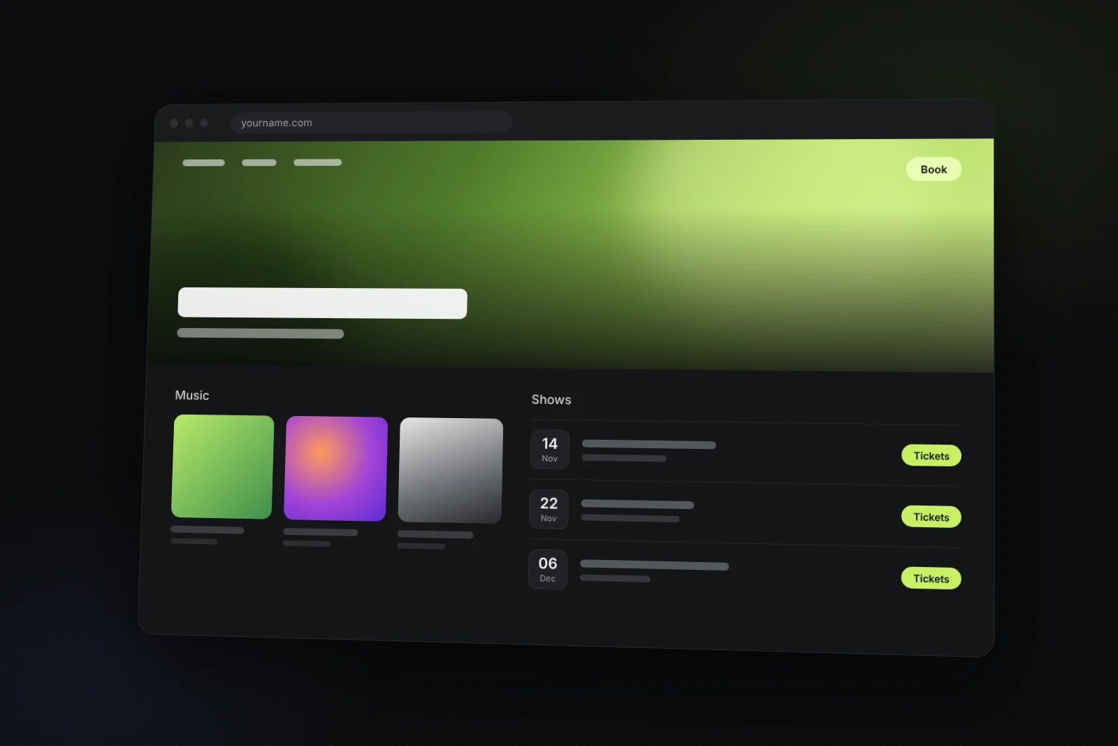
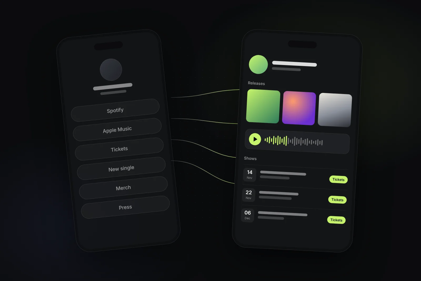
A finished song is half a release. The pitch window, the pre-save, the artwork and the first weeks after release day all have deadlines. A plan is how you meet them.